This Singapore home proves you can live and work beautifully in the same space
After years of apartment living, a Singapore couple built a home that balances work, family and serenity – a light-filled space designed for both productivity and peace.

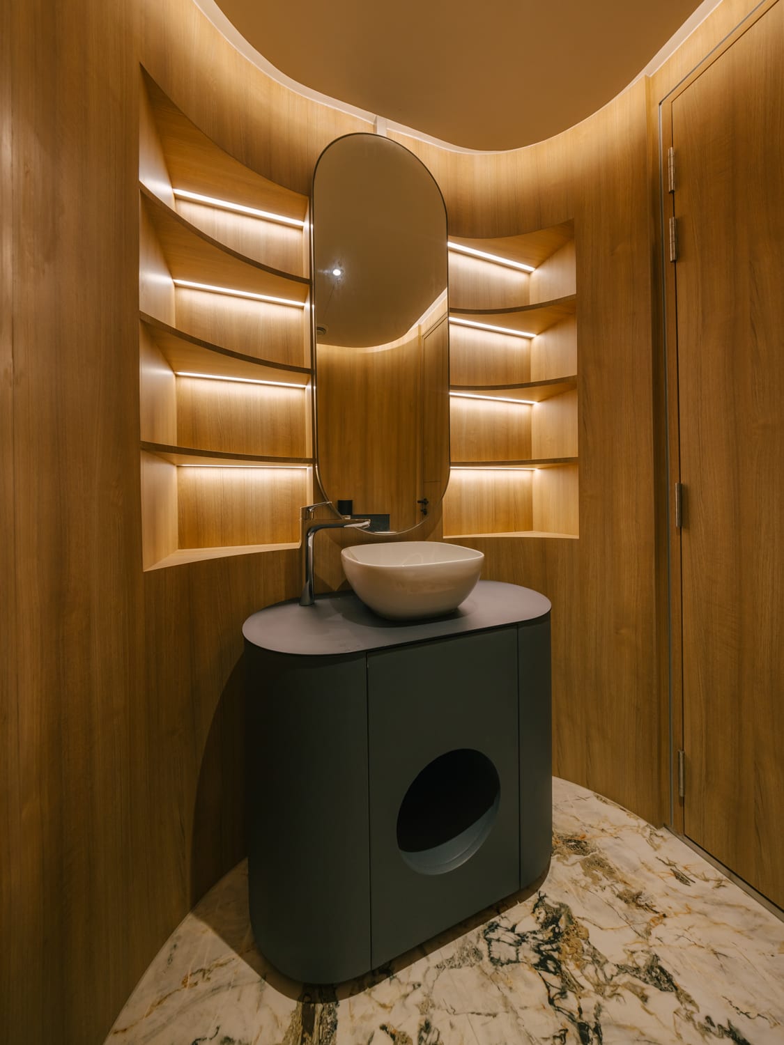
In this Singapore home, thoughtful design and natural light create a calm, functional space for living and working beautifully. (Photo: Finbarr Fallon)

This audio is generated by an AI tool.
Houses are more than mere structures; they are repositories of memories and aspirations, containing the stories of their occupants across different stages of life. For this couple and their three grown daughters, this house represented the third chapter of their journey.
“For many years, we lived in a landed house before moving to an apartment that was comfortable, practical, and filled with memories of our daughters growing up. But as our family matured and our routines changed, we began to feel the limits of apartment living and decided to move back to a landed home,” said the husband.
The family wanted “more space, more light, and a stronger connection to nature,” and engaged Melvin Keng and his team from Kaizen Architecture for the job. It was the first time the owners had designed their own house, and they didn’t want it to be just a sanctuary – though that was certainly a prerequisite.
“It was also about designing for the next chapter – a home where our daughters could return to and where gatherings with friends and family would feel effortless,” said the husband, who works in the IT industry and declined to be named.
The daughters are away most of the time. The two older ones studied in Sydney and decided to stay there for work. The youngest daughter will complete her university studies soon, and will likely follow in her sisters’ footsteps.
Although they are rarely home, the homeowners want them to feel that the house is also theirs. “They return once or twice a year. During each visit, they stay for a few weeks,” said the husband. The daughters were free to design their own bedrooms but all made similar choices: a minimalist palette with soft textures, large wardrobes, and ample workspace.
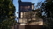
The original house was a two-storey structure with white walls and an orange terracotta roof. During the first viewing, the plan was to retain most of it with just a few touch-ups. However, to meet the family’s needs more fully, they decided to keep the first- and second-storey structure and add an attic above.
“The owners came to us hoping to transform the existing house into something more contemporary, modern, and fitting for a family of six,” said Keng. The sixth member of the household is their live-in helper. The owners were especially particular about having “large, open common spaces for hosting,” he added.
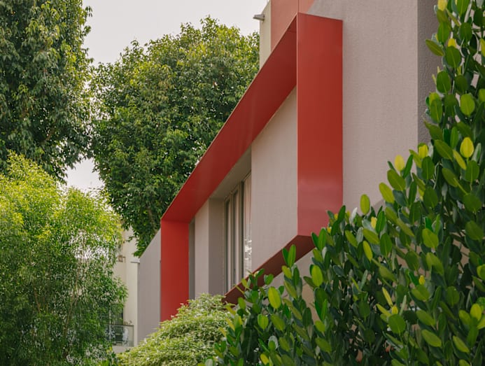
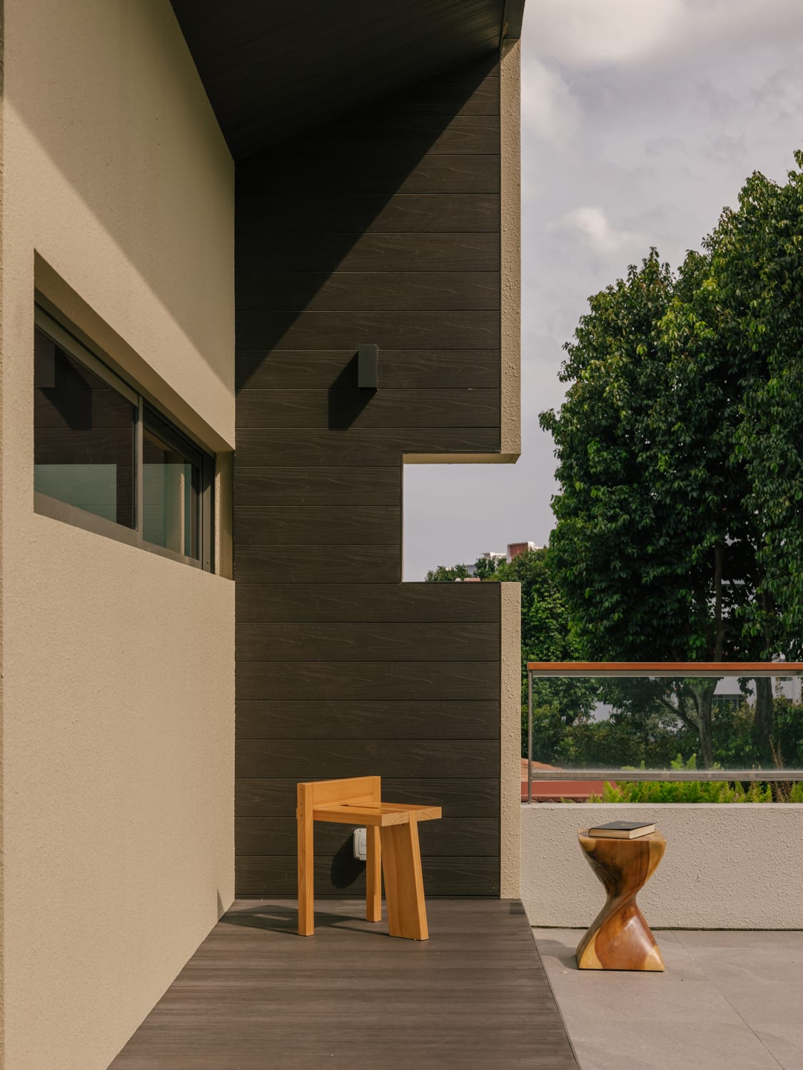
The architecture was conceived as a composition of clean, orthogonal forms. Layers of texture – spray-textured paint, off-form fluted concrete, and composite timber planks – add a sense of dynamism to the facade. There are also terracotta-red elements, inspired by Keng’s recent fascination with the works of famed Mexican architect Luis Barragan, known for his bold use of saturated tones.
Keng christened the project Sekiso House for the way its levels are stacked atop one another (“Sekiso” means “layering” in Japanese). Each floor serves a distinct purpose: the common spaces occupy the first storey, the daughters’ en-suite bedrooms the second, and the master bedroom suite the attic level.
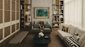
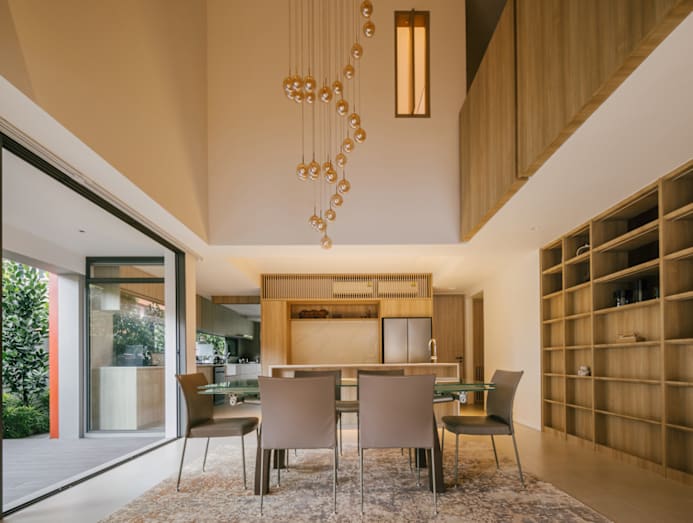
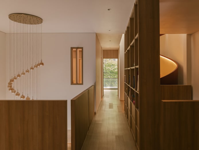
The “stacks” of the house are not entirely disengaged from one another. Keng carved out a double-volume void above the dining table, into which the second-storey family room looks. “The dining room was designed as the soul of the home,” said Keng, who highlighted the lofty space with a necklace-like chandelier.
The dining area opens up to the living room but is demarcated by a few steps spanning the house’s width. The wife shared that these steps sometimes serve as casual seating when large groups gather to watch a movie together.
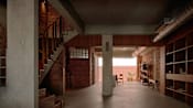
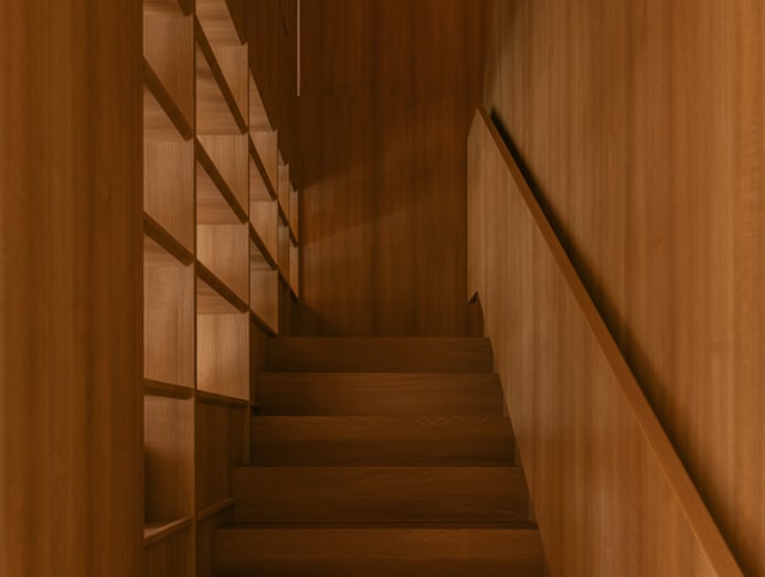
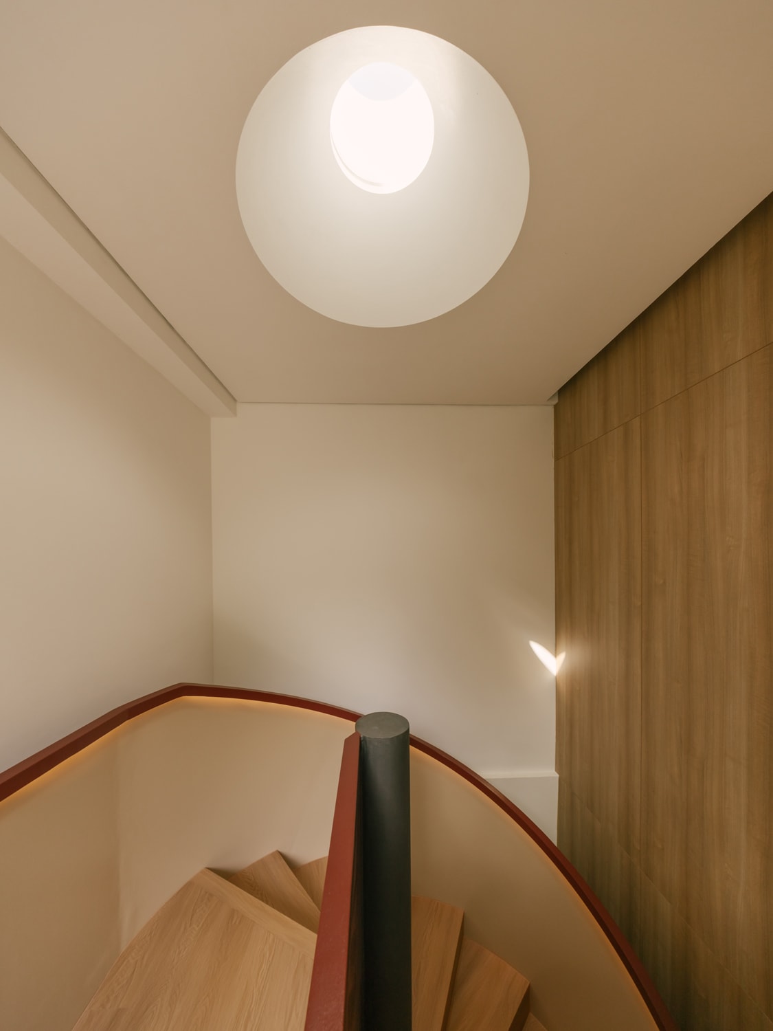
Keng retained the original dogleg staircase between the first two levels but integrated it into a new wall of shelving behind the dining area. A separate staircase was added to link the second storey to the new attic, its sculptural presence breaking the monotony of straight lines and marking the transition to the couple’s en suite.
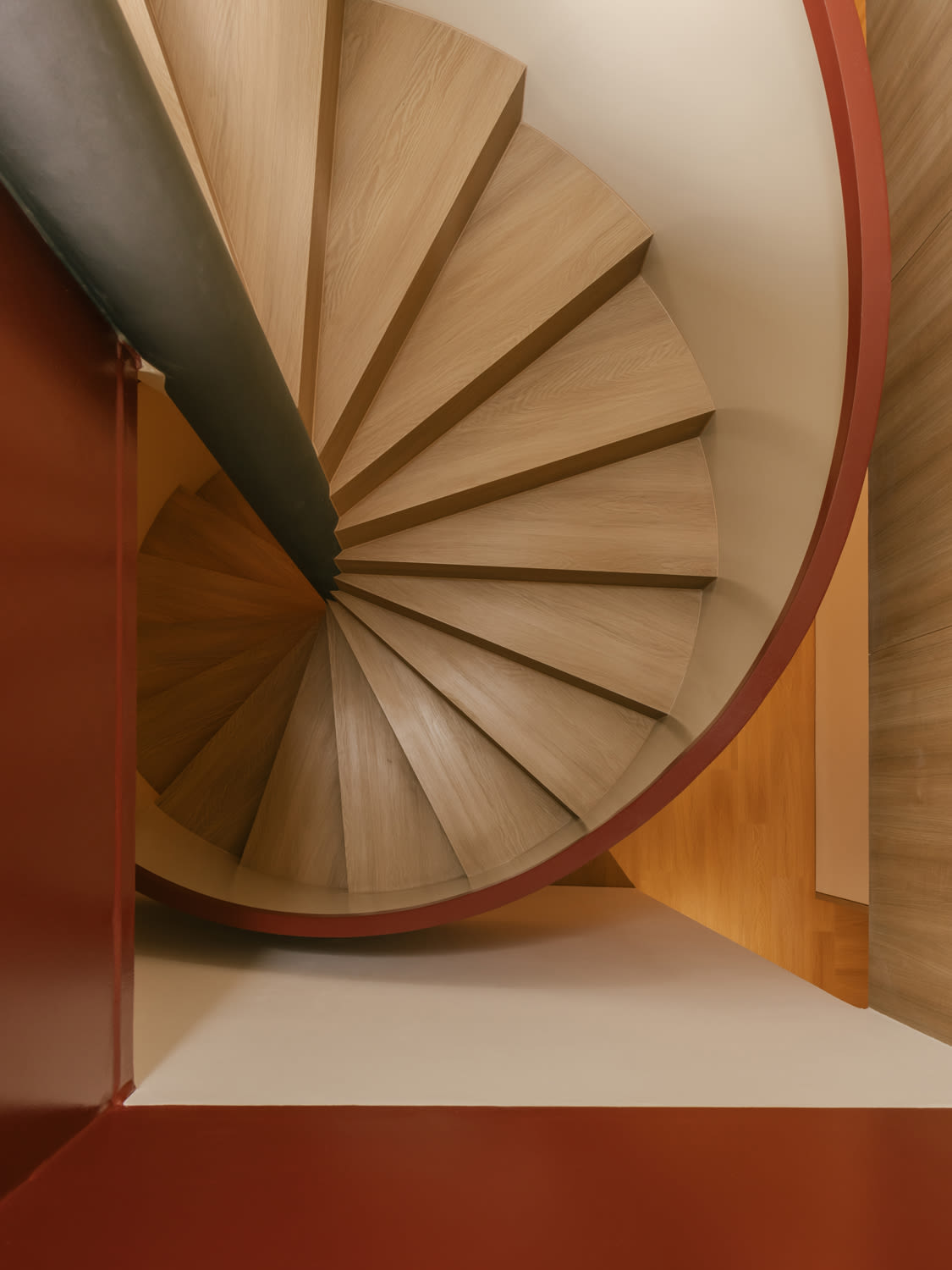
The interior palette mirrors the exterior, with a light-coloured base and subtle accents. Here, the main chromatic statement is the spiral staircase, painted red. “We detailed it with recessed lighting on the handrail and a contrasting beige tone on the inside of the steel balustrade,” Keng explained. A conical skylight above highlights the curving structure, bathing it in natural light during the day.
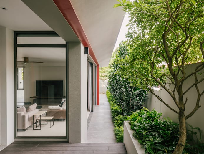
The original first storey had been very closed up, which Keng felt was a missed opportunity, given that this is a corner semi-detached house with an extra strip of land on one side. It is now noticeably brighter and airier, thanks to larger openings and sliding glass doors in the living and dining areas.
The views from the first storey are also more pleasant than before. “When we did the design, we proposed opening up the sides and dressing the boundary walls with lush planting. That way, the living and dining areas could open out to these spaces,” Keng said. A one-metre-deep canopy runs along the side of the house, linking the car porch at the front to a sheltered patio at the rear, providing shelter from both rain and sun.
Keng also created more interior space on the first storey by extending the footprint outward. He indented the wall facing the dining area to form a sheltered patio for outdoor rest or meals; during large gatherings, guests can spill into this space and still feel part of the event.
“People drift naturally from the island counter in the dry kitchen to the small courtyard, then back to the dining table,” the husband explained, adding that visitors say the house feels calm, private, and “easy to be in.” He elaborated, “Even with larger groups, the house never feels crowded. The design allows for openness without losing the sense of connection – something we appreciate deeply when hosting.”
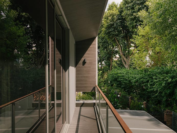
Upstairs, balconies for each bedroom let the daughters enjoy the outdoors during their private time. The rear room faces a condominium development surrounded by greenery and mature trees. “We saw the opportunity to borrow a bit of landscape,” Keng said, referring to how they opened the spaces to the view.
In the attic, the owner’s study or home office overlooks the same condominium and its verdant greenery. A band of windows above the desks frames the foliage. The owner shared that he enjoys working here and can spend hours being productive, inspired by the serene view.
The master bedroom also offers a good vantage point at the front of the house. “It has an unblocked view overlooking the surrounding houses and an expansive view of the sky,” the husband remarked.
The daughters are away most of the time but the house is still well used by the owners. “Our weekdays are filled with work,” said the patriarch, adding that he and his wife, who is in real estate, often spend their days at home. Mornings usually start with calls or work at the study desk.
Sometimes, the “office” moves to the dining table as the couple enjoy the view of the courtyard outside, lined with slender trees. “They provide privacy while allowing natural ventilation to flow through the entire house, making this cul-de-sac home feel even more tranquil,” said the husband.
The living room also becomes a workstation at times. This is not surprising, given the tropical, resort-like feel of the space, with large windows looking out to the greenery. “It creates an easy rhythm between indoors and outdoors, with soft daylight filtering through the trees,” said the husband. “This design also provides privacy and natural ventilation throughout the entire house, making this cul-de-sac home feel even more tranquil.”